 Website


lead capture form examples
Use Case Swipe File: Lead Capture Form Examples With Field Templates
A practical swipe file of lead capture form examples by use case, with copy-ready field templates, A/B test ideas, and build steps you can apply immediately.
This swipe file organizes proven lead capture form examples by use case, including newsletter signups, gated content, demo requests, and cart-abandonment popups. Each example comes with the field count, trigger type, and one specific tactic you can copy today. You’ll also get ready-to-use templates, a decision framework for choosing the right format, and the exact steps to build these forms with WebsitePublisher.ai.
TL;DR:
- Restrict form fields to the minimum needed for the goal, typically one to two for newsletters and up to six for demos or gated content.
- Trigger popups based on user behavior, such as exit-intent or scroll depth, to increase conversion rates threefold compared to page load triggers.
- Use clear, outcome-oriented headlines and CTA copy to align visitor expectations with the form’s purpose, boosting responsiveness.
- Ensure forms are accessible by including visible labels, keyboard navigation, and high contrast, which broadens potential conversion across all visitors.
- Prioritize immediate booking and follow-up automation over form length, as these tactics significantly improve lead capture effectiveness.
Table of Contents
- Lead Capture Form Examples By Use Case
- Why These Examples Work: The UX Patterns Behind the Conversions
- How to Choose the Right Lead Form: A Decision Framework and Field Templates
- Building These Forms in WebsitePublisher.ai
- Making Lead Capture Forms Accessible to Every Visitor
- Privacy and Compliance: What Your Lead Form Needs to Say
- Our Perspective: Common Mistakes and Quick Wins
- Build These Forms Faster With WebsitePublisher.ai
- Sources
- FAQ
Lead Capture Form Examples By Use Case
Every high-converting form starts with a question: what does this visitor actually want right now? A newsletter signup asks for almost nothing because the commitment is low. A demo request can ask for more because the visitor is already close to a buying decision. Below, we’ve grouped real-world patterns by use case so you can match the format to your own offer instead of copying a form that doesn’t fit your funnel stage.
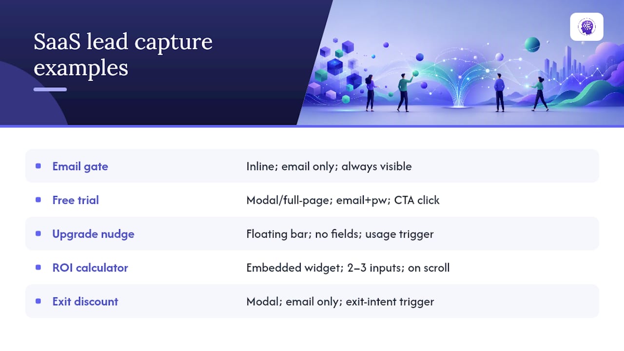
SaaS lead capture form examples
1. The one-field email gate on the homepage hero. Format: inline, embedded directly below the headline. Fields: email only. Trigger: always visible, no delay. The tactic to copy: pair the single field with a headline that states the specific outcome (“Track your first invoice in 5 minutes”) rather than a vague value prop. Clear headlines that answer “what do I get” consistently outperform generic copy in conversion audits.
2. The free trial signup with progressive fields. Format: full-page or modal. Fields: email and password on step one, company size and use case on step two. Trigger: click on primary CTA. Copy this: ask only for what you need to create the account first, then collect qualifying details after the account exists. This is progressive profiling in action, and it keeps the initial friction as low as possible while still giving your sales team useful signals later in the onboarding flow.
3. The in-app upgrade nudge. Format: floating bar at the bottom of the screen. Fields: none, just a CTA button that opens a pricing modal. Trigger: usage threshold (e.g., third project created on a free plan). The tactic: trigger on behavior, not on time. A visitor who just hit a plan limit is far more receptive than one who has been on the page for 10 seconds.
4. The interactive ROI calculator. Format: embedded widget mid-page. Fields: two or three inputs (team size, current tool spend) before revealing an email gate for the full report. Trigger: scroll into view. Copy this: let the visitor invest a little effort first. By the time they hit the email field, they’ve already done work they don’t want to waste.
5. The exit-intent discount for annual plans. Format: modal. Fields: email only. Trigger: exit-intent (cursor moves toward the browser’s close button). The tactic: offer a specific, time-bound incentive (“Save 20% if you upgrade today”) instead of a generic “wait, don’t leave” message.
B2B services and demo request examples
6. The “book a call” form with instant calendar embed. Format: dedicated landing page section. Fields: name, work email, company, and a dropdown for team size. Trigger: always visible on a demo-request page. The tactic to copy matters more than any other on this list: let the visitor pick a time slot immediately after submitting, instead of showing a “someone will contact you” message. Chili Piper found that conversion rose from roughly 30% to 66.7% when immediate booking replaced a delayed follow-up.
7. The qualifying multi-step demo form. Format: modal, three steps. Fields: contact info first, then company details, then a specific pain point question. Trigger: click on “Request a Demo” button. Copy this: frame the qualifying question as help, not gatekeeping. “Help us tailor your demo: what’s your biggest bottleneck right now?” converts better than “Describe your use case,” because it signals the extra fields serve the visitor’s outcome, not just your sales team’s routing logic.
8. The case study gate with LinkedIn autofill. Format: inline within a resource section. Fields: name and work email, with autofill enabled. Trigger: click on “Read the full case study.” The tactic: never disable browser autofill on B2B forms. Zuko’s research on form behavior found completion rates hit 71% when autofill worked properly, versus 59% when it didn’t.
9. The “talk to sales” floating widget. Format: floating bottom-right widget, expands on click. Fields: email and a one-line message. Trigger: click-to-open, never auto-triggered. Copy this: reserve floating widgets for visitors who actively seek contact, not for interrupting a first-time reader.
E-commerce lead capture form examples
10. The welcome discount pop-up. Format: modal. Fields: email only. Trigger: time-on-page (10 to 15 seconds) or scroll depth (25%). The tactic: give a specific, redeemable code in the confirmation state, not just “check your inbox.” Visitors want proof the discount is real before they leave the tab.
11. The cart-abandonment recovery form. Format: modal, triggered when a visitor moves to leave the checkout page with items still in the cart. Fields: email plus an auto-applied discount code. Trigger: exit-intent on the cart or checkout page. Copy this: pre-fill the discount code in the confirmation message so the visitor doesn’t have to search for it later. Popupsmart’s tracking of popup behavior shows exit-intent and other triggered popups convert 2 to 3 times higher than popups that fire the moment a page loads.
12. The back-in-stock notifier. Format: inline button on the product page that expands into a single email field. Fields: email only. Trigger: click on “Notify Me.” The tactic: keep this as close to a one-click action as possible. Any visitor who wants a specific out-of-stock item is already motivated.
13. The post-purchase upsell email capture. Format: inline on the order confirmation page. Fields: email (often pre-filled from checkout) plus a checkbox for a loyalty program. Trigger: automatic, on order confirmation. Copy this: this is the highest-intent moment in the entire funnel. Use it for a loyalty list, not a generic newsletter pitch.
Content publisher and newsletter examples
14. The single-field newsletter bar. Format: inline, top or bottom of article. Fields: email only. Trigger: always visible. The tactic: match field count to offer value. A newsletter signup should never ask for more than an email address, since the commitment on the visitor’s side is minimal, according to lead form benchmarking from monday.com.
15. The content upgrade gate. Format: inline box embedded mid-article. Fields: name and email. Trigger: appears after the visitor scrolls past the section referencing the downloadable resource. Copy this: place the gate exactly where the value is mentioned in the text, not at the very top of the page before context is established.
16. The gated ebook or whitepaper form. Format: dedicated landing page. Fields: name, email, and company (3 total). Trigger: always visible on the resource page. The tactic: 3 to 5 fields is the sweet spot for gated content. Fewer feels like you’re leaving qualification data on the table; more starts killing completion rates, per VWO’s audit of lead form patterns.
17. The scroll-depth content gate for premium articles. Format: full-screen overlay. Fields: email only, or email plus a “subscribe” toggle. Trigger: scroll depth (50 to 70% through the article). Copy this: never gate the opening paragraphs. Let the reader get invested before asking for anything.
Event and webinar lead capture examples
18. The webinar registration form. Format: dedicated landing page. Fields: name, email, company, and job title (4 fields). Trigger: always visible. The tactic: include the exact date and time above the fold, not just “register now.” Specificity reduces the hesitation that comes from an unclear commitment.
19. The waitlist form for a sold-out or future event. Format: inline or modal. Fields: email plus a single interest dropdown (“Which topic interests you most?”). Trigger: click on “Join Waitlist.” Copy this: the interest field doubles as segmentation data for your follow-up email sequence.
20. The post-webinar resource follow-up form. Format: inline on a thank-you page. Fields: none required, just a CTA to download slides via a pre-filled email link. Trigger: automatic, immediately after webinar signup confirmation.
Quiz and interactive lead capture examples
21. The multi-step “find your plan” quiz. Format: full-screen, multi-step. Fields: three to five multiple-choice questions, then an email gate to reveal results. Trigger: click on “Take the Quiz” CTA. The tactic: this format is one of the most consistently high-converting patterns in the entire catalog, because each answer increases the visitor’s investment before you ask for contact details. Multi-step and gamified formats are repeatedly flagged as top-performing tactics across conversion audits.
22. The assessment or scorecard form. Format: embedded widget. Fields: five to eight quiz questions, email gate before showing the score. Trigger: always visible on a dedicated landing page. Copy this: promise a personalized result, not a generic PDF. “See your website’s conversion score” beats “Download our checklist.”
Why These Examples Work: The UX Patterns Behind the Conversions
Every example above rests on a small number of repeatable principles. Once you understand them, you can build new forms without copying a template line for line.
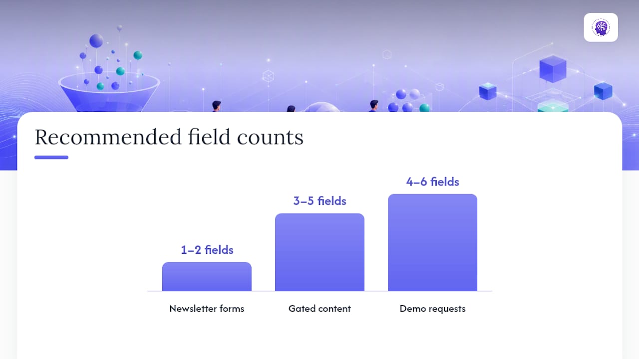
Field count discipline is the single biggest lever you control. The rule of thumb from lead-form benchmarking is straightforward: 1 to 2 fields for newsletters, 3 to 5 for gated content, and 4 to 6 for demo requests, since each additional field should serve a specific routing or qualification purpose. If a field doesn’t change how you follow up, cut it.
- Ask yourself before adding any field: does this trigger a different email sequence, a different sales rep, or a different pricing conversation?
- If the answer is no, the field is friction with no payoff.
- Progressive profiling lets you defer non-essential fields to a later step, such as an onboarding flow or a second email, rather than the first form a visitor sees.
CTA and headline phrasing move numbers more than most marketers expect. A headline that states a specific outcome, paired with a CTA that names the outcome instead of the action (“Get My Free Audit” instead of “Submit”), consistently beats generic phrasing in conversion audits. The mechanism is simple: visitors respond to what they get, not to the mechanics of clicking a button.
Trigger timing changes conversion rates more than most design tweaks. Popups fired the instant a page loads interrupt a visitor before they’ve decided the content is worth their time. Triggered popups, tied to exit-intent, scroll depth, or time-on-page, convert 2 to 3 times higher because they fire at a moment when the visitor has already signaled interest.
Statistic Callout: Enabling browser autofill lifts form completion to 71%, compared with 59% when autofill is broken or disabled. That’s a meaningful swing for a change that takes minutes to implement, according to Zuko’s form analytics research.
Trust signals matter most at the exact moment a visitor hesitates, right before they tap submit. A one-line privacy note (“We’ll never share your email”) placed directly under the submit button reduces the last-second doubt that causes abandonment. On mobile, the button itself needs to be large enough to tap without zooming. Undersized mobile buttons are one of the most common, and most fixable, conversion killers we see across customer projects.
Pro Tip: Test your form on a real phone, not just a resized browser window. Emulators miss keyboard overlap issues that hide your submit button on actual devices.
How to Choose the Right Lead Form: A Decision Framework and Field Templates
Start with your goal, not your favorite format. The decision flow runs in one direction: goal determines format, format determines fields, and fields determine what you measure afterward.
- Define the goal. Are you building a list, qualifying sales leads, recovering abandoned carts, or filling event seats? Each goal points to a different format.
- Match the format to the goal. Low-commitment goals (newsletter, waitlist) use inline or floating widgets. High-commitment goals (demo requests, gated ebooks) use dedicated landing pages or multi-step modals.
- Pick the field count from the template below, then cut anything that doesn’t feed a specific automation.
- Choose the trigger. Always-visible for core pages, exit-intent for recovery, scroll-depth for content gates, click-to-open for quizzes and calculators.
- Set the one metric that matters. Completion rate for simple forms, cost per qualified lead for demo forms, and recovered revenue for cart-abandonment.
Copy these templates directly:
- Newsletter: 1 field (email). Trigger: always visible, inline. Test: subject-line style headline versus benefit-style headline.
- Gated ebook: 2 to 3 fields (name, email, optional company). Trigger: scroll-depth or click on download link. Test: gate placement (top of page versus mid-article).
- Demo request: 4 to 6 fields (name, work email, company, team size, use case). Trigger: always visible on a dedicated page. Test: immediate calendar booking versus “we’ll be in touch” confirmation. This single change nearly doubled conversion in Chili Piper’s benchmark data, moving from roughly 30% to 66.7%.
- Cart abandonment: Email plus auto-applied discount code. Trigger: exit-intent on checkout page. Test: percentage discount versus flat-dollar discount.
- Waitlist: Email plus one interest field. Trigger: click-to-open. Test: single interest dropdown versus multi-select checkboxes.
- Quiz: Multi-step, 3 to 5 questions, then email gate. Trigger: click on “Take the Quiz.” Test: number of questions before the email gate (3 versus 5).
Before you finalize any template, map it to the automation it triggers. A field that doesn’t route to a specific email sequence or sales alert is a field you can cut without losing anything.
Building These Forms in WebsitePublisher.ai
Our platform lets you describe the form you want in plain language, and it builds the page, fields, and integration in one pass with built-in support for many common integrations, including email and CRM tools, so the form you design connects to your follow-up sequence.
Here’s how a demo-request landing page comes together:
- Describe the page. Tell the builder you want a demo-request landing page with name, work email, company, and team size fields.
- Map fields to your CRM. Connect the form fields to your CRM integration so each submission routes to the right list or sales rep automatically.
- Enable immediate booking. Add a calendar integration so leads pick a time slot right after submitting, following the same pattern that lifted demo conversion in Chili Piper’s data.
- Set the follow-up automation. Connect an email integration to fire a confirmation and a reminder sequence without manual work.
- Edit visually. Adjust copy, field order, or layout directly in your browser after the initial build, without starting a new AI session from scratch.
Pro Tip: Build the confirmation state before you build the form itself. Knowing exactly what a lead sees right after submitting makes it much easier to decide which fields actually matter.
Making Lead Capture Forms Accessible to Every Visitor
A form that only works for mouse users and sighted visitors is losing leads before anyone sees a conversion report. Every input needs a visible, properly associated label, not just placeholder text that disappears the moment someone starts typing. Placeholder-only labels fail screen readers and vanish for anyone who pauses mid-fill and forgets what the field was asking for.
Keyboard navigation deserves the same attention as mouse clicks. A visitor should be able to tab through every field, trigger the submit button, and close a modal using only a keyboard. Test this yourself: unplug your mouse and try to complete your own form.
Color contrast matters more on forms than almost anywhere else on a site, since error states often rely on red text or red borders alone. Pair color with an icon or a written message (“Email address is required”) so a colorblind visitor isn’t guessing which field failed.
Modals and pop-ups need a way to close that doesn’t depend on precise mouse targeting. A tiny “x” in the corner is a common failure point. Give it enough tap area, and make sure the escape key closes it too.
Error messages should appear next to the field they describe, read aloud correctly by screen readers, and never disappear before a visitor has time to read them. These fixes take little development time and widen the pool of visitors who can actually complete your form.
Privacy and Compliance: What Your Lead Form Needs to Say
Every lead capture form that collects personal data touches privacy law, whether the visitor is in the European Union, California, or elsewhere. GDPR requires clear, affirmative consent before you collect or process personal data from EU/EEA residents, which means a pre-checked consent box doesn’t satisfy the requirement. The checkbox has to start unchecked, and the consent language has to state specifically what you’ll do with the data.
CCPA gives California residents the right to know what personal data a business collects and the right to request its deletion. If your form serves visitors in California, your privacy policy link needs to be easy to find near the form itself, not buried three clicks deep in a footer.
Consent management gets more complex once you add marketing automation on the back end. If a single email field triggers both a newsletter subscription and a sales follow-up sequence, your form copy needs to say so. A one-line disclosure (“By submitting, you’ll receive our newsletter and occasional product updates”) keeps the consent honest and reduces spam complaints later.
Practical steps that apply regardless of jurisdiction: link your privacy policy directly below the submit button, never pre-check a marketing consent box, and store consent records with a timestamp so you can prove compliance if a visitor asks what they agreed to. None of this requires a legal team to implement on a simple form, but it does require checking your specific regional obligations before launch.
Our Perspective: Common Mistakes and Quick Wins
Across customer projects, the same three mistakes show up repeatedly: too many fields on a first-touch form, popups that fire on page load instead of on intent, and a “we’ll be in touch” confirmation instead of an immediate next step. Each one is a quick fix. Cut fields down to what routing actually requires, switch load-triggered popups to exit-intent or scroll-depth, and add calendar booking to any demo form.
The highest-leverage test to run first is the booking-immediacy change, since the benchmark data shows the largest swing of any single tactic on this list. Test that before you touch field count or copy. Everything else is optimization at the margins.
Build These Forms Faster With WebsitePublisher.ai
WebsitePublisher.ai turns the templates above into working pages without hand-coding a single form field. Describe the landing page you want in plain language, and the builder handles the layout, the fields, and the integration that sends each submission where it needs to go, whether that’s an email list, a CRM, or a calendar booking tool.
Three ways teams put this to work right away: a demo-request page with immediate calendar booking built in, a gated resource page that connects straight to an email automation sequence, and an event registration page tied to a waitlist workflow. Each one uses the same conversational build process, so switching between them doesn’t mean starting from a blank template every time. Once a page is live, you can still edit copy, adjust fields, or swap the trigger logic directly in your browser, without opening a new AI session to make a small change.
If you’re ready to see the fields and integrations in action, check the AI website builder page for a walkthrough of how lead capture connects to existing tools, or visit the pricing page for details on current plans. For teams thinking about follow-up sequences once a lead comes in, pairing your capture form with a lead nurturing strategy keeps the momentum going after the first submission.
Sources
- Does browser autofill affect form conversion rate? | Zuko
- Form conversion rate benchmark report | Chili Piper
- Lead generation forms: examples and best practices | VWO
- 15 Lead Generation Form Examples That Convert in 2026 | Popupsmart
FAQ
Can you give an example of a lead capture form?
A common example is a homepage newsletter bar with a single email field, always visible, that promises a specific benefit in the headline. A more advanced example is a demo-request form with four to six fields that lets the visitor book a calendar slot immediately after submitting.
What do lead capture forms mean?
A lead capture form collects a visitor’s contact details, usually in exchange for something of value like a resource, a discount, or a scheduled call, so a business can follow up and move that visitor toward becoming a customer.
How do I create a lead capture form?
Start by defining your goal, then pick a format and field count that match it, following the templates in the decision framework above. Tools like WebsitePublisher.ai let you describe the form in plain language and connect it to email or CRM integrations without manual setup.
Can you give an example of a lead generation campaign?
A webinar registration campaign is a common example: a landing page collects name, email, company, and job title, then an automated follow-up sequence sends reminders before the event and a resource link afterward. A gated ebook campaign works the same way, pairing a 3-to-5-field form with a nurture sequence once the download completes.
Recommended
Build your site the same way
Describe what you want. Your AI builds and publishes it — with a real backend behind it.
See how it works →